
Thursday, 13 October 2011

Wednesday, 12 October 2011
Mock up Idea for Digipak
I have decided that I going for a direct narritive approach for my digipak, I am taking inspration from the Rolling Stones album 'Let it bleed'. The front and back cover depictes an abstract cake on a vinyl record player, the front panel shows the cake in a good condition. However on the back panel the cake and vinyl has been smashed up. This would follow the narritive thoughout the digipak and create continity, furthermore it is related to the song that we are doing for the music video 'banquet'; due to the association with food.


Front Cover

Back Cover
I found that the digipaks I analysed and looked at were mostly abstract, which is a common connotation within a digi pak so this will follow that connation that has already been set. This will make our band stand out from the normal covers that you would expect such as the front cover featuring a picture of the band.
Its now dawned on my that one other idea that I could try is showing the cake slowly being eaten away throughout the digipak.
Its now dawned on my that one other idea that I could try is showing the cake slowly being eaten away throughout the digipak.
Poster Mock Up Ideas
For my mock up of the album poster I am using a food theme with major brand labels. This is because the song is called Banquet. I am looking at photos like "Campbell's Soup" by Andy Warhol for ideas. I am usibng a food theme rather than a shot of the band to show that our band is not just a generic boy rock band.
Tuesday, 11 October 2011
Music poster anaylisis- The Jam
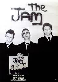
This is the style of poster i would like to create for my piece. I like how the poster itself reflects what the band is about, showing the three-pieced band looking cool and sharp. The suits they are wearing shows them fresh which at the time rspresented the music. I also like how in the poster the band are holding up the album which has the exact picture on the cover as the poster, this keeps to a theme. The chice of clothing has been specifically chosen as it will work on the black and white theme as the contrast in creates gives the effect. It look as if the picture has been taken in front of a wall with the bands name'The Jam' wrote on the background in Grafitti. The picture tells the audience everything there is to know about the band and their style so little writing is needed to give information. This is the effect i would try and create as i feel to much writing can make the audience lose interest in the poster.
Monday, 10 October 2011
Digipack analysis- The Beatles


This album digipack imidiatly stands out for me and is one of the mose effective i have come across. This too similar to other successful iconic covers has a running theme throughout the digipack. This is all shown in black and white which stands out when we first look at it. It's big bold writing is effective as it is the title 'Revolver' that we first see when opening the digipack. This sharpness and clearness also reflects the music that is on the album. I like how the naming of the band does not feature on the cover, this shows that buyers of the album will be familar with the band as they are one of the biggest of all time. The cover of the album is intresting in the fact it is different. It shows the faces of the band but in a rough sketch illustration, and this shows they are easily recognisable as people would immidiatly know the band just from this. The album cover was created by artist and bassist Klaus Voormann, who was a friend of John Lennons from the bands time in Germany. Voormann later recieved a Grammy Award for Best Album Cover, Graphic Arts for this work. I like the crazy design of he cover and how it dosn't really make sense or link to the music on the album, but however is still effective and renound as one of the most iconic covers of all time. Voormann came up with this design from a number of drawins in his scrapbook that came together. (Information from http://beatlestrivia.com/who-created-the-cover-illustration-for-the-beatles-revolver-album/)

Sunday, 9 October 2011
Digipack analysis- The Stone Roses


In this album digipack by The Stone Roses the colour scheme is what stands out to me first as being what attracts me to it. I like the constant running theme throughout of the famous Union Jsck flag, which suggests this is proud british band that is also resebeling the idea of MOD as this flag symbolised that for previous successful bands such as 'The Who' and 'The Jam'. The album cover dosnt actually show the flag in it's complete form but we know from the combination of the colours red, white and blue that this is what they trying to show, and i like this immidiatly makes us think of the Union Jack flag.
The writing in the inside of the digipack is set out in lines with simple font to make it easy to read. Each line of writing alternates from red to blue on a white background, this again keeps the theme of the flag running. I feel i could create a theme with similar effect to show the audience what genre of music we are portraying and style we are representing. Also, the picture of the band has a painted colage behind them and this mainly has the colours of the Union Jack flag in it. For me it gives the impression that you can make an effective background without putting too much effort in, this album cover proves this.
Subscribe to:
Posts (Atom)