Hello,
Throughout the course there has been moments of highs and lows, but what we can all agree on is that we feel we have achieved much more than we first thought.Overall we have all enjoyed the course and have learnt many different skills. We are all particularly proud of the way our music video turned out and hopefull you will see the reasons why.
We hope you enjoy reading through our blog and through all our individual posts.
Thanks,
Tom, Jake and Jack
Showing posts with label Jack Ludford. Show all posts
Showing posts with label Jack Ludford. Show all posts
Friday, 23 December 2011
Wednesday, 21 December 2011

Tuesday, 20 December 2011

Monday, 19 December 2011
Friday, 9 December 2011
Question 4 How did you use media technologies in the construction and research, planning and evaluation stages?
We used many different technological devices in the production of both the draft and final music video, and for the digipak and poster combination. When filming the music video we used the Internet socialising site of Facebook to communicate with each other and decide on a time and location we would film. This helped us to be organised so we could arrange lifts to enable us to all arrive together to gives us the best chance of filming in an easy and efficient way. To communicate we also used the technology of Mobile phones, with the three of us being on a contract phone meant we could text to organise where to meet and what times.
During the research part of the course when we were deciding what song choice and genre to use, we used http://www.blogspot.com/ to keep each other updated about what we had found and to show our individual ideas. We got images and information off http://www.google.com/ to show exactly what we wanted the bands style to be. Uploading this onto blogger allowed the teacher to see our initial ideas of what we wanted to do for our video, and using this site to record our research enabled the teacher to leave feedback on what we had posted. We also set up a Twitter account for a fake band to post details on what the band were doing music wise and what our plans for the near future were. We did gain a few followers from this account which did boost the recognition of our band. To gain followers who thought we were a real band suggests to us that we looked convincing enough to be a real band. I also used a site called Tube chop when analysing music videos that were of the same rock/indie genre i was looking at. I found this easy as it allowed me to take certain sections out of the video to analyse separately.
For the production of the digipak and poster for the media side of the band, i used Photo shop for the full design and making of both. I took the photographs using a Nikon camera that i already owned. This high-tech digital camera enabled me to get the images i wanted and then i used a memory stick to transfer the image from my computer at home to the computer at school. For the fonts i used on the digipak and poster i got them off http://www.dafont.com/ as we could chose from a variety of fonts and find one that fitted the genre of music i was representing.
When making the music video, we filmed it using a HD video camera. We found this easy to use as we uploaded all the shots we had filmed onto a macbook pro and edited the shots into the video from there. We found this an efficiant way to edit as we could all edit our scetion of the video seperatly and then put it together using the Macbook.
Thursday, 8 December 2011
Question 3 What have you learned from your audience feedback? Draft
After the production of our music video we have received feedback from teachers and fellow students saying what they like or dislike about the video, which left mixes reaction either way depending on the audience we asked. We used different methods to show our final video to a range of different people when asking for feedback.
We showed the video to my form group with students viewing between he ages of 14-18, and we gave each student a questionnaire to fill out after they had watched the video. We asked questions such as 'What genre of music do you listen to?' to gain an insight to weather or not they listened to the same genre we had targeted. From looking through the completed questionnaires we found that the majority of the 14-16 year old were listening to 'R and B', 'Chart' and 'Pop', so we were asking students that were not into the genre that this particular song fell into, which is rock/indie. We asked 'What did you think of the setting of our music video?' to find out if they thought stereotypes had been followed with our specific genre of music. We had comments back that said the location 'suited the song' and 'made it look professional' which are encouraging signs. We asked 'What bands does this music video remind you of?' and a lot responded with 'Arctic Monkeys', 'Kaiser Cheifs' and 'Kasabian' which was again encouraging feedback as these bands fitted into the music genre we were trying to represent. We also received feedback from the students telling us we reminded them of 'Paramore' and 'Mcfly', which were not our music genre but we took into consideration the reason for this being because the age group asked were listening to this and because the band members were young, it immediately reminded them of this style of music.
We did receive some constructive criticism in the response to the question 'How could we improve our video?' One comment left was 'If the singer got the syncing right'. This comment did make us consider if the syncing was exact to how it should be but we are still pleased with the final product. Another comment said 'Make the camera less wobley', this left us unsure on what was meant by this as we had a constant still camera but believe it might have been the fast changing of shots that they didn't enjoy. The feedback we received for the camera work was mainly positive so we were still pleased with what we had achieved.
We asked 'What would you give our music video out of 10?' and found we had an average rating of 8/10, so again this was encouraging to hear. Overall the feedback we received from the questionnaire was very encouraging and we were pleased with the comments left. Although the majority that took part were not the targeted age group or targeted genre of music, we were still left with enough positive comments to be told we had succeeded.
We had recieved feedback from our teacher who had commented in a blog post on our final video. We were told we had done 'a good job' which was again very encouraging. In lessons we have had posotove feedback from both our teachers.
I recieved constructive feedback from the draft of my digipak and poster. I was told by my teacher to make it as simple as possible to suit the genre of music. An example i was advised to look at was 'Suck it and see' by Arctic Monkeys and to create something similar to their simple but yet still effective design. I also went as far as using a similar font style abd colour. I was told this would work as it has been successful with past album covers.
Question 2 How Effective is the Combination of Your Main Product and Ancillary Texts? Draft
I think i kept our music video and my Ancillary products similar to eachother in the fact they both followed a simplicity theme. This continued idea of simpllicity works with the rock/indie genre especially in the video as it allow the audience to focus mainly on the song that is being played, and the idea of a performance video also enhances the song that is being played as it again gives the audience the chance to see it being played live. The live performance video shows off the bands style and the audience knows the genre of the band just from watching the video.
When deciding on an idea for my digipak, it only seemed right to follow a similar theme to the video so the audience know what style and genre of music they can expect. I wanted to leave it plain with a simple colour background and font to make the audience feel the choice is up to them what they think of it and the fact it is so simple gives the cover an edge of suspision about what the music is, which will create attention for itself by people being interested by it's simple design and wanting to listen to it. My draft digipak was a similar style but with more detail on the cover. After looking at previous album covers that have been plain and been successful such as The Beatles 'White Album' and Arctic Monkeys 'Suck it and see' and with the band image i was creating being fitting into the same genre it only seemed right to leave it plain. This idea of plain is represented in the music video in the fact it is all filmed at the same place.
The performance video also helps advertise thae band as it gives the impression that the song played is live. This shows how the band act on stage and energetic performance from the front man gives away the genre of band just by how he acts on stage. His passionate singing makes him stand out as the main fontal point of the band the audience are consantrating on him to lead the rest of the band. This is the affect we wanted and we are pleased with his performance. It shows a big improvement from our draft as the performance he gave works really well with the idea of a live performance video, as the dress sense and the way he looked like he was enjoying himself makes a good front man.
I used the same font throughout my digipak and poster to create a sense of similarity. I have used it on the poster so the people that have seen the digipak will recognise the font and associate it will the band. I have done this with the colour scheme throught the digipak as well to create a continous theme that runs through both the digipak and poster.
Media Evaluation Draft Question 1
When deciding the idea for our Music video we had a clear intention to make a live performance video. We looked at the existing video for Banquet which was our song choice and their video was a live performance, we realised that would work well for us to create a video in a similar style. We looked at other live performance music videos such as The Cribs 'Hey Scenesters' and The Raconteurs 'Steady As She Goes'. From watching and analysing both these videos we found ideas for shots and camera angles that we knew would work as they had been demonstrated in these videos. We also got ideas for what the band should wear during the video and we took inspiration from bands such as Arctic Monkeys, The Vaccines and Oasis. The changing of our frontman helped with the styling of the band, as the main focus of the video was on him, his style set the style of the band. We tried to have the other three members of the band dressed in a similar fashion to send a contiuous theme and so that the band look as realistic as possible.
The video we looked at to resembe the most was 'Hey Scenesters' by The Cribs. We liked the rawness of the video and how it looks like it was filmed in a band members garage. This gives it a simplistic effect and we wanted to re create something similar.
This clip of the video is similar to what we wanted to re create with the fast changing close up camera angles. After watching and analysing many videos in this genre of music we learned that close ups are interesting to watch and engage the audience closer to the band. We have also used similar camera angles when filming the drum shots again because we knew it would work. The CCTV effect of the opening shot of the band also appealed to us and was something we wanted to add to ours. There is evidence of this in our video at the ending when we walk out of the room. We set the camera up high in the corner to give a CCTV effect of the room we were filming in.

We learned from our draft that the first person we had as our singer, did not match the criteria we were looking for in a front man. We needed to find someone that dressed in the appropriate style that suited our bands style. We also needed someone who was willing to put a bit more passion into the miming of the song. We were pleased with the person we did get as our frontman (Max) as was willing and very confident when performing during the filming. This made our video look more realistic as he gave the impression he was acctually singing it. We wanted our frontman to resemble an energetic frontman, similar to what we had seen in videos of the same genre. Frontmen such as Tom Meighan from Kasabian or a young Jarvis Cocker. We wanted to dress our fronman in similar style clothing as Ryan Jarman fron The Cribs and Justin Young from The Vaccines. We knew this would be acheivable as he dresses in this style.
When thinking of an idea for my Digipak i realised from research that music in the genre i was looking at kept things simple in the media. So that i what i decided to do, by taking the cover of Arctic Monkey's latest album 'Suck it and see' and making a design similar to it. In doing this i was hoping to acheive recognition for the same genre of music. There is a trend in plain album covers that only show the title of the band or the name of the album, this was first done by The Beatles with 'The white album' and from then on was assosiated with this genre of music. I kept the whole digipack simple to create a recuring theme of simplicity, from researching other bands albums such as The Vaccines, Arctic Monkeys and Oasis i realised it works effectivley. I did the same with my poster in keping it similar to the album cover and using the simplicity of it for effect. Music posters from bands such as Manic Street Preachers, Bloc Party and Oasis all showed that a successful music poster shows the album cover so the audience recognise the cover so they know immidialey what band is being advertised on the poster. This is what i wanted to creeate as it was proved by bands i have mentioned previously that it works.

Friday, 25 November 2011
Final Music Video
Below is our final submitted version of our music video, we all feel that it has hugely improved from our first draft. What contributed to this to the group as a whole being a lot more organised when it came to filming. An experienced lead singer (Max) who has been in other media projects added to the better, more professional video as a whole. Finally another key difference from the draft is that we all participated in the editing of the final video. When we edited the draft video, it was mostly edited by Jake which has not been the case for the final version. Overall myself and and everyone else in the group feel that we have produced a video that we are all proud of.
Untitled from Jake Boswell on Vimeo.
Feel free to post some feedback on our final video!
Untitled from Jake Boswell on Vimeo.
Feel free to post some feedback on our final video!
Wednesday, 23 November 2011
Final Filming
We filmed the final shots for our music video at the Stay Free Studios in Leicester which is the nsame location we used to film our draft. We decided this was the best thing to do to keep consistance as we knew the layout of the studio and we had already identified how to solve problems we encountered from our previous time there.
We found from our footage of our draft that the shots were too dark, so we took an inspection light (as shown in the Animoto post) and we shon the light facing a clear white board which lit the entire room. We originally had the light facing directly at the stage but we as the actors found it too bright to look onto. After looking back at the shots we filmed we realised it had worked.
For the final video we brought in a new actor to have the role of the singing as we felt the person we used for our draft didn't give us the image we felt was needed to be the frontman. The new actor brought in gave us the image we wanted as the frontman and he fitted with the image. We went to the studios more organised with a set table of what we were going to be filming and in what order. This made filming more efficiant as we knew what we were doing before we got there. It was also important we filmed at the same place as we knew how were going to film and the positions to put our camera in so we didn't waste time sorting this out.
Monday, 14 November 2011


Friday, 14 October 2011
Digipack mock

I have chosen to use a running theme throught my digipack as my research has shown me that this stands out to the audience and makes it intresting. My mock up digipack has a cartoon theme for it and i have decided to do this as it has been successful with well known bands such as The Beatles. Similar to their album Revolver' i have kept a running colour scheme throughout and i decided to keep it the same colour as the painting i have taken from Andy Warhol. There is a sketchy drawing font i have continously used throughout the digipack, this is because i have tried to keep it simple.
Tuesday, 11 October 2011
Music poster anaylisis- The Jam
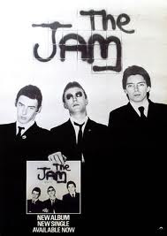
This is the style of poster i would like to create for my piece. I like how the poster itself reflects what the band is about, showing the three-pieced band looking cool and sharp. The suits they are wearing shows them fresh which at the time rspresented the music. I also like how in the poster the band are holding up the album which has the exact picture on the cover as the poster, this keeps to a theme. The chice of clothing has been specifically chosen as it will work on the black and white theme as the contrast in creates gives the effect. It look as if the picture has been taken in front of a wall with the bands name'The Jam' wrote on the background in Grafitti. The picture tells the audience everything there is to know about the band and their style so little writing is needed to give information. This is the effect i would try and create as i feel to much writing can make the audience lose interest in the poster.
Monday, 10 October 2011
Digipack analysis- The Beatles


This album digipack imidiatly stands out for me and is one of the mose effective i have come across. This too similar to other successful iconic covers has a running theme throughout the digipack. This is all shown in black and white which stands out when we first look at it. It's big bold writing is effective as it is the title 'Revolver' that we first see when opening the digipack. This sharpness and clearness also reflects the music that is on the album. I like how the naming of the band does not feature on the cover, this shows that buyers of the album will be familar with the band as they are one of the biggest of all time. The cover of the album is intresting in the fact it is different. It shows the faces of the band but in a rough sketch illustration, and this shows they are easily recognisable as people would immidiatly know the band just from this. The album cover was created by artist and bassist Klaus Voormann, who was a friend of John Lennons from the bands time in Germany. Voormann later recieved a Grammy Award for Best Album Cover, Graphic Arts for this work. I like the crazy design of he cover and how it dosn't really make sense or link to the music on the album, but however is still effective and renound as one of the most iconic covers of all time. Voormann came up with this design from a number of drawins in his scrapbook that came together. (Information from http://beatlestrivia.com/who-created-the-cover-illustration-for-the-beatles-revolver-album/)
Sunday, 9 October 2011
Digipack analysis- The Stone Roses


In this album digipack by The Stone Roses the colour scheme is what stands out to me first as being what attracts me to it. I like the constant running theme throughout of the famous Union Jsck flag, which suggests this is proud british band that is also resebeling the idea of MOD as this flag symbolised that for previous successful bands such as 'The Who' and 'The Jam'. The album cover dosnt actually show the flag in it's complete form but we know from the combination of the colours red, white and blue that this is what they trying to show, and i like this immidiatly makes us think of the Union Jack flag.
The writing in the inside of the digipack is set out in lines with simple font to make it easy to read. Each line of writing alternates from red to blue on a white background, this again keeps the theme of the flag running. I feel i could create a theme with similar effect to show the audience what genre of music we are portraying and style we are representing. Also, the picture of the band has a painted colage behind them and this mainly has the colours of the Union Jack flag in it. For me it gives the impression that you can make an effective background without putting too much effort in, this album cover proves this.
Friday, 7 October 2011
Album cover research- Pink Floyd

I like how the most simple covers can usually be the most effective and this 'Dark side of the moon' by Pink Floyd stands out as one of the most iconic album covers of all time. The bright colours that are put together on a black background makes the cover instantly stand out. It is also intresting as the triangle placed in the middle with the line of colours running through it makes us want to find out if it has a meaning. The cover also leaves us wondering what music you are buying if you are not familiar with the band, as it gives little information away about the genre. This works as an advantage as this is one of the most successful albums of all time.
CD research

I like the idea of putting an image on the disc like what Feeder have done here. Having the cover of the digipack printed onto the disc itself is a clever idea as it simple to create and carries the theme on adding to the effect, this makes it more intresting for the buyer. I also feel this could be recreated with my cover and disc, giving it something different to other CDs out there. I feel this cover disc when inside the case will stand out against all ohters when it is opened as it will immdidiatly show something different than just a black disc with the bands name on it.
Thursday, 6 October 2011

Subscribe to:
Posts (Atom)