Saturday, 29 October 2011

Draft Video Shoot

Our video shoot started at 4:30 and we finished at 7:30, what we have learnt from having a short time constraint is that we need more time to shoot each individual shot. This was because some time was lost when we were looking on the storyboard. We combatted this issue by Jack telling me where each individual shot needs to be filmed whilst I set the camera up for the next shot. It also became apparent whilst filming that it would be hard to film some shots with the tripod so I filmed with my phone to gain some extra wide shots that we can use in the draft.
Changes that we will make when filming our final version is a more detailed shooting schedule that will ensure that filming goes along smoothly and quickly and that we are not wasting time. Furthermore as an extra precaution  we will film extra shots that we wont necessarily use this footage can then be used as a backup in case some of the shots we film don't work in the final version.

Thursday, 27 October 2011

Filming At Stay Free Studios

We decided to rent out 'the black room' at Stay Free Studios to film our video. When we arrived we noticed that there was limited lighting available, so we had to make use with spotlights and film in the lighter areas of the room. We also had to rent out a bass guitar and symbols for the drum, but apart from that the room was set out in the form of a live music setting. This studio was ideal for our idea as it gave us the perfect oppertunity to film a live performance video. We did encounter some difficulties when filming, the room was small which didn't allow us to film long shots which meant we had to zoom out to get a full shot of the band playing. Also, as we were paying for the room by the hour we found we had to be very time consuming and plan well in advance the shots we were going to take to give us the best chance of filming all of it in the time we had.
We also found that some of the shots we filmed of the vocals we had the lyrics slightly wrong and this makes it hard to get into sync when editing the video. We also had a problem with the lighting as it was a dark room and there was no bright lights. We found when we put the footage up that the background was too dark and it was difficult to see the people in the shots. We have learned from this that we need to take extra lighting and put them up around the room.

Friday, 14 October 2011

Mock up Poster

Poster analysis's

Poster Analysis's

Mock Up digipak

Analysis of Digipaks- Red Hot Chili Peppers- By The Way


This is the album cover of the Red Hot Chili Peppers album, "By The Way". The album cover consists of a background of an open area with a woman in the foreground in a negative image effect. The band name is listed down either side of the cover.


The back of the CD features the band walking through a field in an old fashioned colour. It also features the track listing down the right hand side.


The inside of the case has an alternate album cover. It also has the disc with the album name on it written in a handwriting style font.


The inside of the digipak has several pages which have the lyrics to the songs on them. This is very common in album digipaks. The left hand page has another shot of the band walking through a field, similarly to the back of the album.

Analysis of Digipaks- Avenged Sevenfold- Nightmare


This is the front cover of Avenged Sevenfold's album "Nightmare". The front shows a girl sleeping, with   Death in the background and a gravestone. The background is meant to show what's going on inside her dream. On the gravestone it has the word foREVer, which is a reference to their drummer who died just before the release of the album.

The back of the album continues with the nightmare theme with the dark skies and background.


Inside the CD case there is the booklet for the album and a merchandise leaflet. The CD has a pattern made out of bones on.


Behind the CD is a picture of the band together as a memory of the drummer.


Inside the digipak the artwork continues to play with the "Nightmare" theme.


All of the pictures inside the digipak are in dark colours. The picture on the right shows the band sat around a table but as skeletons. The picture on the left shows the band-members sat in a bar. In all of the shots the background is the main focus of the pictures.

Digipack mock


I have chosen to use a running theme throught my digipack as my research has shown me that this stands out to the audience and makes it intresting. My mock up digipack has a cartoon theme for it and i have decided to do this as it has been successful with well known bands such as The Beatles. Similar to their album Revolver' i have kept a running colour scheme throughout and i decided to keep it the same colour as the painting i have taken from Andy Warhol. There is a sketchy drawing font i have continously used throughout the digipack, this is because i have tried to keep it simple.

Thursday, 13 October 2011

Digipak Mock up

This is my finished mock up for my Digipak, my inspiration from the rolling stones album has been used to my advantage for this mock up. The changes that I have made that has made this my own different Digipak. Instead of the cake being smashed to pieces in the back panel it has instead been completely eaten leaving just a plate with crumbs on. The other Idea I had was that if there was a CD to be included then it would be a quarter of a cake, this would match with the image that is on the left side on inside cover. Its simplicity and the contrast with red that I did in Photoshop gives its a slight vintage feel. I felt that it went quite well with taking the photos of the cake, however I did find using Photoshop 10 a bit overwhelming as I hadn't used the latest version before. Hopefully I shall get used to it so I will be able to do the final design of the Digipak.
Note. The top images would be the other way round if you were not aware.

Digipak analysis - Inside In, Inside Out by The Kooks

Digi Pak Analysis Kooks

Digipak analysis - Dig Out Your Soul by Oasis

Digi Pak Analysis Oasis

Digipak analysis - Echoes, Silence, Patience & Grace by Foo Fighters

Digipak Analysis Foo Fighters

Analysis of Digipaks- Kaiser Chiefs- Employment


The front cover of the Kaiser Chief's alum "Employment" is very simple. It has an old fashioned book style to it. The band name and album name are printed plainly and boldly to stand out and are surrounded by a yellow box to make the writing stand out better.


The back of the album is also very simple. Again it has a very old fashioned style, however, it is made to look like a picture frame with the track listing in the middle.


The inside of the digipak however is more interesting. The Disk is made to look like a roulette wheel as the inside of the digipak seems to be playing with gambling/game themes.


In another part of the digipak the gambling/game theme is continued. On the post-it notes on the snakes and ladders board there are names of producers who produced certain songs on the album.  On the other side there is a page dedicated just to 'thank you's' from the band to people that have helped them.

Album Back mock up

My Mock Up album cover

Wednesday, 12 October 2011

Mock up Idea for Digipak

I have decided that I going for a direct narritive approach for my digipak, I am taking inspration from the Rolling Stones album 'Let it bleed'. The front and back cover depictes an abstract cake on a vinyl record player, the front panel shows the cake in a good condition. However on the back panel the cake and vinyl has been smashed up. This would follow the narritive thoughout the digipak and create continity, furthermore it is related to the song that we are doing for the music video 'banquet'; due to the association with food.


 Front Cover


 Back Cover


 I found that the digipaks I analysed and looked at were mostly abstract, which is a common connotation within a digi pak so this will follow that connation that has already been set. This will make our band stand out from the normal covers that you would expect such as the front cover featuring a picture of the band.

Its now dawned on my that one other idea that I could try is showing the cake slowly being eaten away throughout the digipak.

Poster Mock Up Ideas

For my mock up of the album poster I am using a food theme with major brand labels. This is because the song is called Banquet. I am looking at photos like "Campbell's Soup" by Andy Warhol for ideas. I am usibng a food theme rather than a shot of the band to show that our band is not just a generic boy rock band.

Tuesday, 11 October 2011

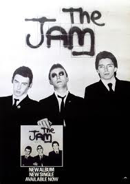
Music poster anaylisis- The Jam


This is the style of poster i would like to create for my piece. I like how the poster itself reflects what the band is about, showing the three-pieced band looking cool and sharp. The suits they are wearing shows them fresh which at the time rspresented the music. I also like how in the poster the band are holding up the album which has the exact picture on the cover as the poster, this keeps to a theme. The chice of clothing has been specifically chosen as it will work on the black and white theme as the contrast in creates gives the effect. It look as if the picture has been taken in front of a wall with the bands name'The Jam' wrote on the background in Grafitti. The picture tells the audience everything there is to know about the band and their style so little writing is needed to give information. This is the effect i would try and create as i feel to much writing can make the audience lose interest in the poster.


Monday, 10 October 2011

Digipack analysis- The Beatles


This album digipack imidiatly stands out for me and is one of the mose effective i have come across. This too similar to other successful iconic covers has a running theme throughout the digipack. This is all shown in black and white which stands out when we first look at it. It's big bold writing is effective as it is the title 'Revolver' that we first see when opening the digipack. This sharpness and clearness also reflects the music that is on the album. I like how the naming of the band does not feature on the cover, this shows that buyers of the album will be familar with the band as they are one of the biggest of all time. The cover of the album is intresting in the fact it is different. It shows the faces of the band but in a rough sketch illustration, and this shows they are easily recognisable as people would immidiatly know the band just from this. The album cover was created by artist and bassist Klaus Voormann, who was a friend of John Lennons from the bands time in Germany. Voormann later recieved a Grammy Award for Best Album Cover, Graphic Arts for this work. I like the crazy design of he cover and how it dosn't really make sense or link to the music on the album, but however is still effective and renound as one of the most iconic covers of all time. Voormann came up with this design from a number of drawins in his scrapbook that came together. (Information from http://beatlestrivia.com/who-created-the-cover-illustration-for-the-beatles-revolver-album/)

Album Cover Ideas Montage

Sunday, 9 October 2011

Digipack analysis- The Stone Roses


In this album digipack by The Stone Roses the colour scheme is what stands out to me first as being what attracts me to it. I like the constant running theme throughout of the famous Union Jsck flag, which suggests this is proud british band that is also resebeling the idea of MOD as this flag symbolised that for previous successful bands such as 'The Who' and 'The Jam'. The album cover dosnt actually show the flag in it's complete form but we know from the combination of the colours red, white and blue that this is what they trying to show, and i like this immidiatly makes us think of the Union Jack flag.
The writing in the inside of the digipack is set out in lines with simple font to make it easy to read. Each line of writing alternates from red to blue on a white background, this again keeps the theme of the flag running. I feel i could create a theme with similar effect to show the audience what genre of music we are portraying and style we are representing. Also, the picture of the band has a painted colage behind them and this mainly has the colours of the Union Jack flag in it. For me it gives the impression that you can make an effective background without putting too much effort in, this album cover proves this.

Friday, 7 October 2011

Album cover research- Pink Floyd


I like how the most simple covers can usually be the most effective and this 'Dark side of the moon' by Pink Floyd stands out as one of the most iconic album covers of all time. The bright colours that are put together on a black background makes the cover instantly stand out. It is also intresting as the triangle placed in the middle with the line of colours running through it makes us want to find out if it has a meaning. The cover also leaves us wondering what music you are buying if you are not familiar with the band, as it gives little information away about the genre. This works as an advantage as this is one of the most successful albums of all time.

CD research


I like the idea of putting an image on the disc like what Feeder have done here. Having the cover of the digipack printed onto the disc itself is a clever idea as it simple to create and carries the theme on adding to the effect, this makes it more intresting for the buyer. I also feel this could be recreated with my cover and disc, giving it something different to other CDs out there. I feel this cover disc when inside the case will stand out against all ohters when it is opened as it will immdidiatly show something different than just a black disc with the bands name on it.

Thursday, 6 October 2011

Metallica- The Black Album


The Black Album is an inspirational album cover as it is very well known for being so bland and simple. However it is one of the biggest selling albums of all time. The idea of it is taken from the film Spinal Tap which features a plain black album as their previous album cover ideas were too innapropriate for release. There are several artists who have also done a "Black Album", including: AC/DC and even JAY-Z.

Cd cover montage

Kings of Leon- Youth and young manhood


I again like the simplicity of this album cover, which seems to be a running theme with bands of the indie/rock genre. We as the audience can tell the genre of music this band is going to be from the cover, as the black on white contrast is recognisable for this genre. I like how there is not too much to take in from looking at the cover and it just shows the bands faces. The haircuts also give away what style they are creating. I also like the limited amount of writing shown on the cover.

Wednesday, 5 October 2011

Album Digipaks

I have been researching album covers, artwork and digipaks. I have been looking at various styles and ideas, including: blank background covers with nothing but the album name on the cover, light trails, time lapses and portraits.

Monday, 3 October 2011

Digipak background

The idea of a digipak is a patented idea originally by IMPAC group Inc., however they have since folded and has merged into the AGI devision. All around the world the digipak name is licensed to various manufurers. The styling of a digipak is commonly used for a CD album which is what we are going to use it for. The design for a digipak usually consistes of a book style paperboard binding with a disk tray for the CD, DVD ect. They were first widely used to replace as an alternative to a jewel case or a dvd box. Their use first grew for using as a CD case in the early 2000s when they became popular with artists and record laels.